
In a world so ~online~, we ought not to forget about the physicality all around us. No matter how much time we spend staring at screens and creating for digital environments, the real world is chock-full of tangible, intentional design.
Sofia Sahade, senior graphic designer at Brafton, indeed spends much of her time producing pixel-perfect visuals for Brafton as our resident in-house designer. But her physical medium experience ascends far beyond any desktop, laptop or mobile device — approximately 30,000 feet above sea level, actually.
Throughout her career, she’s designed visuals for commercial airplane panels and semi-truck sidewalls alike. While we’re yet to fly a Brafton-branded plane over Boston, physical design opportunities come in slightly different but equally nuanced forms. In this case, we’re talking tradeshow booths.
Last year, a Brafton cohort took contentmarketing.ai to its first exhibition: the 2025 Technology for Marketing (TFM) Expo in London. Sofia’s task? To design tradeshow banners, brochures and a custom graphic for the team’s vests — and her processes may not be as far removed from her airplane pictorials as you might think.
I chatted with Sofia to learn more about how she approaches physical design!
Subscribe to
The Content Marketer
Get weekly insights, advice and opinions about all things digital marketing.
Thanks for subscribing! Keep an eye out for a Welcome email from us shortly. If you don’t see it come through, check your spam folder and mark the email as „not spam.“
An Experience, Not Just a Graphic
On a screen, people experience things in similar ways. Aside from negligible differences in screen size or monitor curvature, we often view digital design at arm’s length or closer.
That’s very different from how we see objects in the real world. Designers have to account for medium dimensions, location (relative to viewers and actual placement), perception, interaction and more. That’s not to mention one of the biggest challenges of designing something physical: visualizing what the final product will look like.
Because life-sized mockups just aren’t practical in many cases, Sofia relies on a combination of her design expertise and imagination to bring concepts to life in her mind’s eye.
For a tradeshow booth, that means picturing the kiosk itself, its position relative to other vendors, and attendee lanes.
“Imagine being there,” said Sofia. “Imagine how people will interact with the booth. What do you want people to see from afar? And what do you want them to see when they’re close?”
That’s the biggest difference between digital and physical design, according to Sofia — distance. It matters for everything, from graphic and font size to placement and orientation.
“The exciting part is thinking about how people will experience the booth, how they’ll connect different elements and experience the space as a whole,” she added. “I always want to create something clean, enjoyable to look at and that reinforces the message we’re trying to communicate.”
Designing for contentmarketing.ai: AI, Animated
Sofia was quick to point out the often achromatic color palettes of the corporate world. Big brands — including many AI companies — tend toward black, white and muted neutrals to communicate sophistication.
She explained that Western culture’s association between the color white, for example, and luxury can be traced, in part, to ancient Greek sculptures. For centuries, people believed these statues were intentionally white, when in reality, their creators had painted them in vibrant colors that happened to fade over millennia.
As that misconception spread, so did this idea that restraint equals refinement, and so we got color palettes to match.
contentmarketing.ai is antithetical to that idea, and that’s something Sofia loves about the design language she’s developed for the platform.
„We can use a lot of colors,” she said, “and still manage to create something that feels professional.”
And when we’re designing for an experience rather than to appease an algorithm, emotion plays a key role.
“I think we have something happier,“ Sofia added. And that translates really well to the physical world.
In a sea of serious-looking suits and sterile color schemes, cheerful branding is bound to stand out. And it did! Due in large part to Sofia’s enticing, joyful designs, the Braftonites heading the booth spoke with hundreds of marketers at the show.
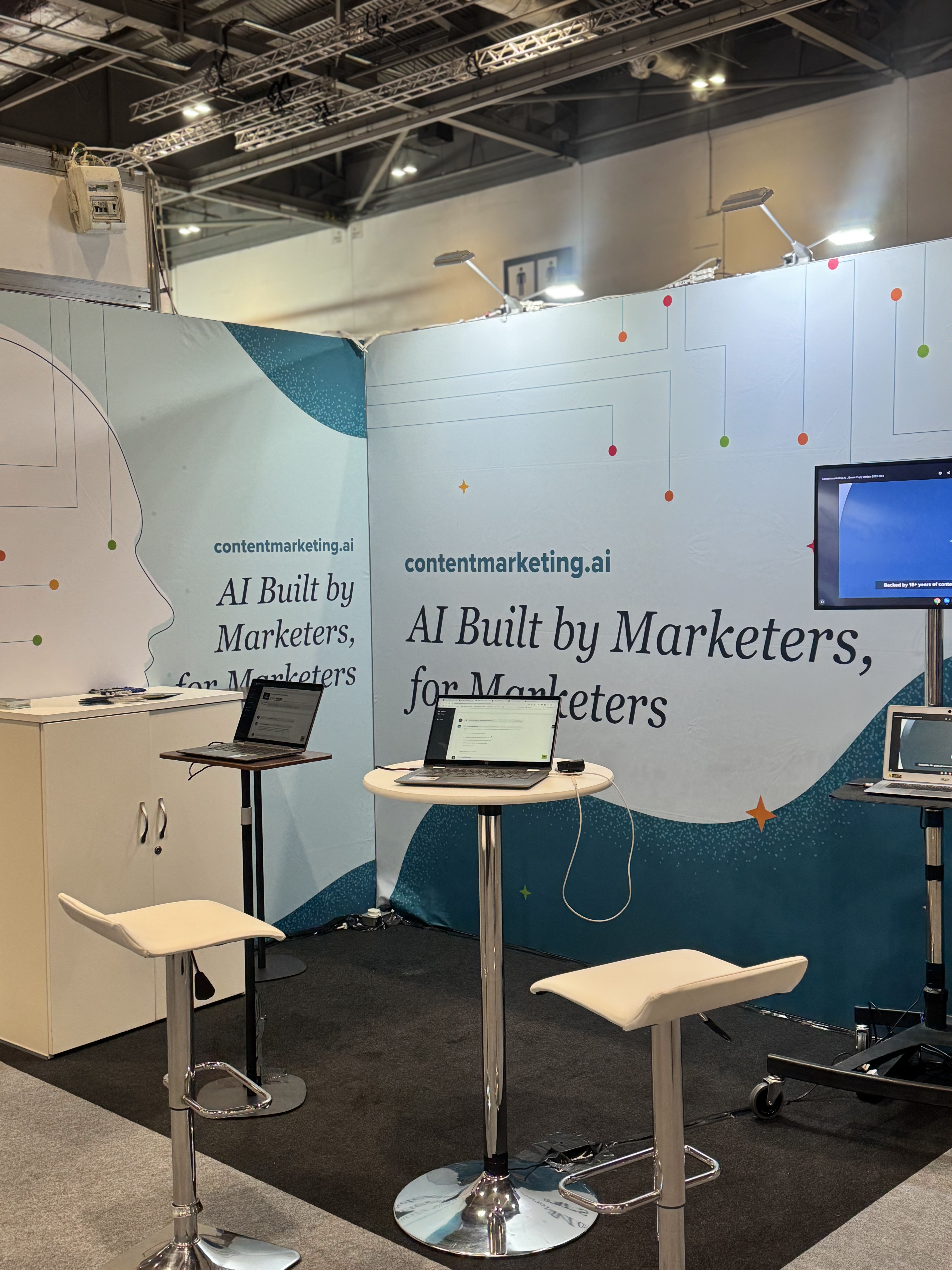
I think it’s more than fair to say that Sofia’s design played a key role in generating attendee interest.
Bringing It Together With a Brochure & Custom Elements
Excellent banner design captures attention from across an event hall, but once someone’s up close, you need to hold it — and then harbor interest after they walk away.
That requires a downsize in design thinking, from an 8-foot-tall kiosk wall to a standard A4 sheet of paper and then an even smaller crest logo on branded apparel. Sofia created all three, ensuring everything worked together to intrigue, inform and align with the experience she wanted to create for TFM attendees.
„The brochure had a lot of content,” Sofia explained. “When you’re working with print materials, you have limited space. That was a fun challenge.”
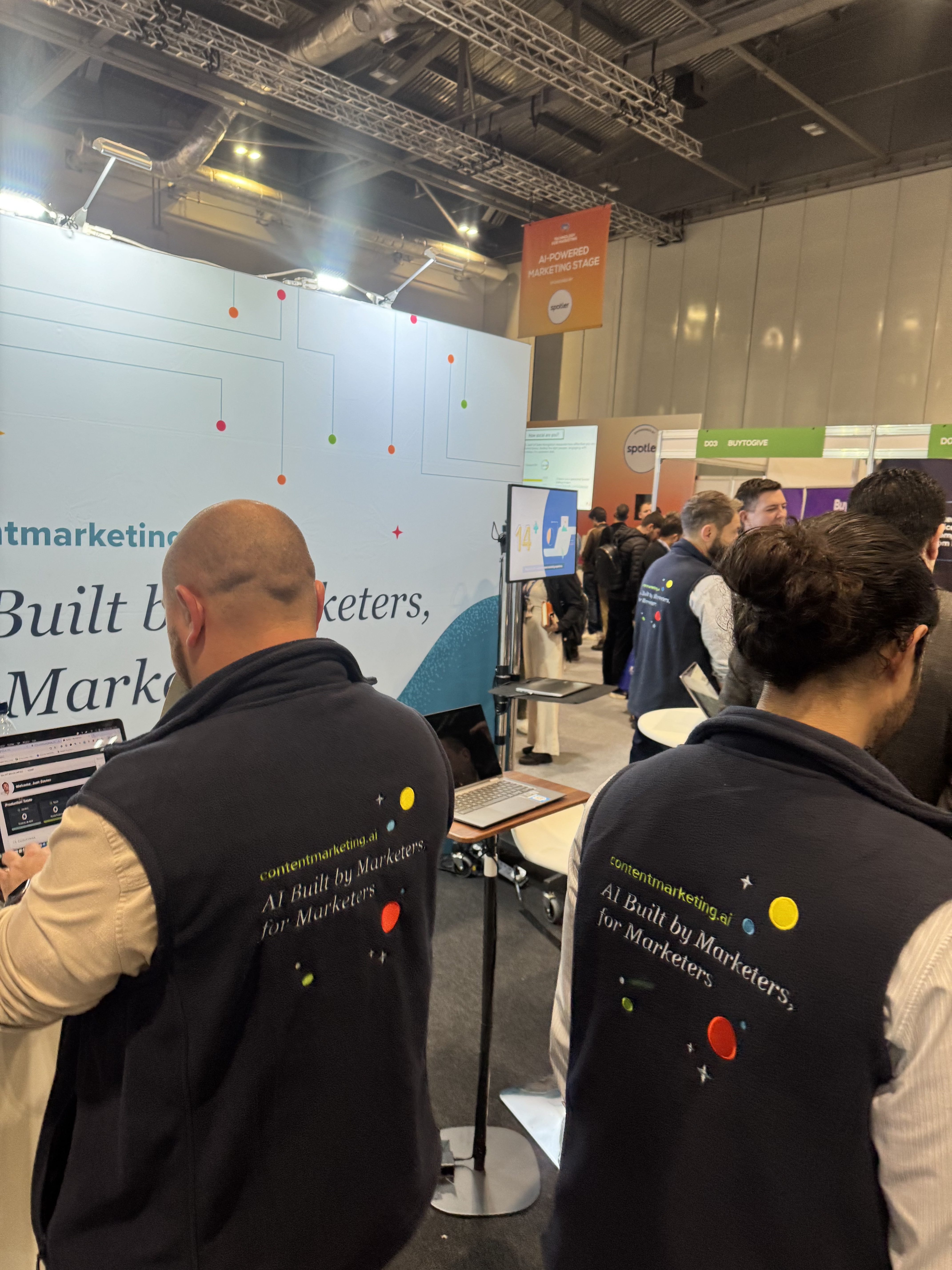
The cherry on top of this design trifecta was the team’s custom contentmarketing.ai vests, complete with a crest logo that looked at home in the booth and behind the stack of brochures, and tied each design element together with a neat bow.
Sofia’s 3 Lessons for Better Tradeshow Design
Reflecting on the project as a whole, Sofia offered a few pieces of advice for anyone new to or interested in designing physical marketing materials, starting with guidelines.
1. Follow the Rules
Physical design, in some ways, is far more precise than digital design because it cannot be pinched or poked to resize once it’s out there on a surface.
“The most important thing is to pay attention to the design template you’re given,” said Sofia.
Physical design is as much about dimensions and formatting as it is about the ultimate vision for the project. Guidelines are there to help designers make their work look its best in the format it’s intended for.
2. Think Beyond the Artwork
Consider how visitors will actually approach the booth, where they’ll stand and what they’ll notice from near and far. That does a lot to inform the finished design.
3. Harmonize Materials
Finally, don’t overlook the value of custom design elements.
“Creating custom elements helps people recognize your brand,” said Sofia, explaining how cohesive, custom design can reinforce a brand or product’s recognizability. In this case, that meant banners and brochures and custom vests.
But whether it’s a distinctive illustration style, color palette or thoughtfully designed apparel, consistency across touchpoints helps create a stronger first impression.
Final Thoughts
A tradeshow booth isn’t just a collection of banners, brochures and smiling associates. It’s often someone’s first real interaction with your brand, and every design decision shapes that experience.
Capture attention with large-scale design, hold it with refined materials and bring it all together with a cohesive visual identity.