
Industry: Ecommerce
Content: Blog content, infographics, UX consultancy
Highlights: UX design changes increase blog revenue by 83%
“How can a blog provide real business value?” This is a question we’ve heard a lot over the years from apprehensive marketers – and strong calls to action that engage readers are one solution.
Quality content is the first step to a successful blog. But once you have your readers’ attention with words and images, urging them to continue down the buyers‘ path is your ticket to monetary success. Brand awareness and blog engagement are critical, but conversions will have the most immediate impact on the bottom line.
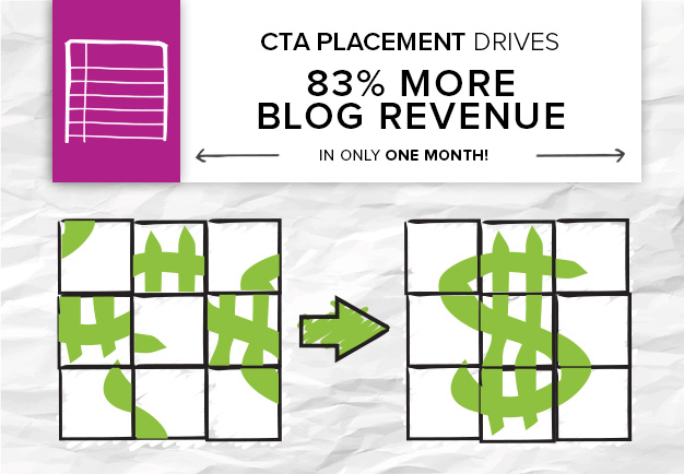
For one ecommerce client, a blog had proven success in getting users interested in products – they were seeing 5x more revenue from the blog year over year. But, UX design changes had an immense impact on their blog’s revenue. Here’s what happened:
Problem:
- A design refresh correlated with a decrease in blog conversions. CTA buttons for relevant product pages had previously occupied the top right hand corner of the blog, but were moved to the bottom of the page.
Strategy:
- Build a content archive around the company’s top products, with CTA buttons that related specifically to the products mentioned within the blog posts.
- Bring in a UX mockup to test optimal placement.
Brafton Content:
- CTA buttons to accompany Brafton content, which includes:
- Blog content – 1 to 2 weekly posts
- Quarterly infographic
- Quarterly white paper
- Social media distribution
- Video content: About Us videos, product videos
Results:
- Updating article templates for CTA buttons increased revenue in one month by 83 percent, despite a traffic increase of only 1 percent. This was across channels – organic search saw a 431 percent increase, email referral traffic had a 300 percent increase.
- Ecommerce conversion rate increased quarter over quarter to 22.03 percent (average across ecommerce websites according to Monetate Ecommerce Quarterly is between 2-3 percent)
- Average order value for blog readers increased quarter over quarter 48.53 percent
4 Tips for better CTA buttons
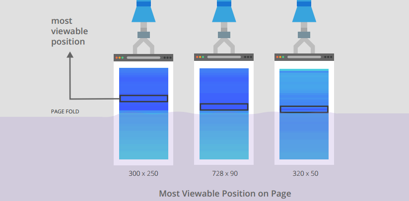
Placement: Google research shows the best place for a CTA button is „above the fold“ of a page, but closer to the bottom than the top of this area. Many brands fall into the trap of putting essential elements front-and-center in their layouts, but it seems that they’re better off after text but before scrolling is necessary for them to be seen.
- Have revolving calls to action. You want to make sure that CTAs are specific to each piece of content. Brafton clients will have five to 10, sometimes even more, content categories. Each category should have its own specific set of calls to action to make sure:
- we speak directly to the person reading the article
- we present an offering that’s extremely relevant to increase the chance of conversion
- we position the „context“ to reduce the bounce rate
- Stay on brand (but make it pop) Design Director Ken Boostrom said a good CTA uses the brand’s aesthetic, color and tone but accents it in a way that stands out. It needs to get your attention – but not by screaming at you the entire time. There isn’t a specific color that’s best for a CTA – but whatever it is, it should give viewers a certain feeling. For example – blue builds trust and security, while orange is associated with things that are inexpensive. More here
- Use first person. When you utilize first person, you’re thinking from the reader’s perspective, not the marketer’s. “Download my guide,” for example, is more effective than “Download your guide.” Don’t take my word for it: One study said first person CTAs can boost conversion rates up to 90 percent.
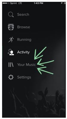
(I don’t want to bash my favorite music streaming service, Spotify, but it has always irked me that the section where my playlists are on the app is labeled “Your Music.” If this is my account, and the playlists I’ve created, shouldn’t it be “my music?” Because they’re developing the app from their perspective, it makes sense. But from the user’s perspective – it’s first person, not second.)
Want to see more examples of how small design changes can have a big impact? Check out: