

Email is crucial for communicating with your audience. About 58 percent of adults in the U.S. check their email when they wake up, according to Ezanga. And as MarketingSherpa found, nearly three-quarters of consumers prefer email marketing over other communications from businesses.
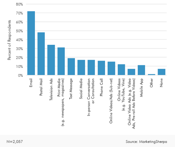
More consumers preferred email over other forms of business-to-consumer communication.
From laying the groundwork of targeting your leads and choosing topics, to writing the subject and body, to designing the graphics and layout, creating a stunning email can be a long and arduous process. Here’s our guide to getting every element right, and common pitfalls to avoid:
Target before putting pen to paper
Before you can even begin crafting your email, you need to plan who will receive it. The Direct Marketing Association found that about 58 percent of email revenue comes from targeted and segmented emails. Emails sent to general audiences with generic messaging run the risk of reaching the eternal “unread” status.
DO target subscribers based on persona, demographics and stage of their buyer’s journey. This can be a fairly simple step, especially if you’re already using marketing automation software. When a reader receives an email that appears personalized and well-targeted, you can often expect healthier open rates, higher ROI, more leads and fewer unsubscribes, as research from Lyris, Inc. confirmed.
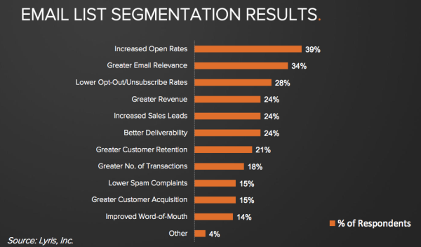
Recipients will be more likely to open, read and convert when you segment your lists.
Everything from the design, layout and look to the subject line, messaging and CTA of your email should vary based on who is going to open it. For example, emails about local events can be targeted to your lists from that area, B2B industry news can be categorized and routed to audiences who work in that space, and B2C marketing retention emails can reference products or services that a user has already purchased or expressed interest in.
DON’T use the same layout, images and copy for all your campaigns and audiences. An influencer and a decision-maker will have different standards for the design and tone of an email, even if they work at the same company. One general email won’t resonate with multiple audiences nearly as well as personalized, targeted newsletters can.
The subject line is your way in
It takes no more than a few seconds for a recipient to read a subject line and make their decision to open the email or not. You only have a handful of words to convince them to click.
DO use direct language with just a hint of urgency. Adestra found that subjects with words such as “free,” “daily” and “alert” lead to increased opens. Language like this makes it easier for your audience to glean the value of your offer, giving them more incentive to click.
Subject line design extends beyond enticing language. Eye-catching subject lines are often personal as well. Your audience is more likely to be drawn into emails if they see their name, industry and/or location mentioned in their inbox view. As Adestra reported, they will be 22.2 percent more likely to open them, too.
DON’T use false, overly dramatic urgency. If your audience gets the sense that you’re exaggerating, they’ll treat your email like spam. Stay away from ALL CAPS, symbols, emoticons and too many exclamation points, and never risk having your subject line get cut off in the preview due to length. These attributes will cheapen your messaging, make you seem unprofessional, reduce open rates and eventually lead to unsubscribes or complaints.
Find a balance of value in your email
Even when your email lists are segmented into narrow, specific groups, finding the right mix between information and entertainment (or advertising and engagement) can be a real challenge.
DO balance education and entertainment with promotion. Hubspot suggested that good newsletter copy should only consist of 10 percent promotional content, with the rest focusing on educational material. If your audience is getting value from your newsletters, they’ll be more receptive of your emails, your brand and your offer.
DON’T bug people to buy or take any action, especially if your data suggests your users aren’t responding well. Email is one of the best places to find actionable analytics on your audience, so there’s no excuse for misaligning your subject matter with your readers. Shape your email topics and offers based on the results of past campaigns.
Make the body text digestible
Your audience has already clicked into your email, and the main body text needs to keep them engaged.
DO keep the writing light and readable. Use a clean font and make sure the margins are narrow enough to keep the reader’s eyes moving down. Scannable text and a friendly voice will help hold your readers
’ interest, and keep their eyes on your content, instead of heading back to their inboxes.
DO use a clear CTA in your email. Honest language, coupled with vibrant, branded design will help your email call-to-action shine.
DON’T write a book. An email isn’t where you show your audience all the content you’ve produced all month. It should deliver a manageable, targeted curation for your specific segments.
DON’T be tempted to overload an email with multiple CTAs or links back to your site, either. This can destroy the focus of your newsletter.
Graphics should be eye-catching but restrained
No email newsletters should contain just text. Rich emails that include images, videos, charts or animations perform better when crafted tastefully. In fact, a 2014 report from Invodo found that just including the word “video” in your subject line increased open rates by 19 percent. Considering video marketing has only grown more popular since then, odds are good this medium will continue to be effective in email marketing.
DO include a branded header graphic, and use at least one other feature image, not including small thumbnail pictures or social icons.
You’ll also need to include a plain text version of every email to ensure your message gets through clearly to everyone. While images are a key part of any email newsletter, they run the risk of not loading properly on certain platforms, which can turn readers off. A text-only version will automatically appear on problematic email clients and will also reach visually impaired users.
DON’T use background images. If they don’t load properly, they could ruin how your email appears to the recipient. You should also avoid using too many graphical elements. Hubspot found that survey respondents claimed to prefer emails with mostly graphics over mostly text. However, graphic-rich HTML email open rates were lower than open rates for plain text emails in a subsequent test the marketing automation provider conducted.
Lay out your email so people can read it
The technical step of designing and laying out an email is often the largest part of the process. It requires optimizing the email for wide ranges of display options.
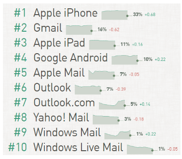
DO design your email for every device and email client. Litmus Email Analytics found that the top 10 email devices and clients were wide spread. They’re also fairly evenly weighted, so you really do need to consider how your email will look on all of them.
If you fail to make your email universally readable, you’ll risk cutting key audiences out of the conversation. As a fail safe, you should always include a link for readers to view the email in a browser. This allows you to share your content in a more uniform way, since there tends to be less disparity between web browsers than email clients.
DO position your images on the lefthand side. Our eyes naturally start in the upper left-hand corner of a page, and usually follow an F-shaped pattern on the screen. Put your images where readers will see them first.
A study from Jakob Nielsen found that the upper left corner is a hot spot, making it a great place for images.
DON’T overload your email with rich elements. Too many static or animated graphics can clutter your message, increase load time and drown out your brand, not to mention overwhelm your readers.
DON’T exceed three columns of content. You should only be working with about 600 pixels of width, so breaking your text or images into narrow blocks can make your content hard to see and unwieldy for your reader.
Bulletproof targeting, text and layout can be the difference between your audiences converting from an email and unsubscribing from it. We take for granted how amazingly useful email marketing can be: Marketers are have the ability and power to directly message their clients, leads, prospects or fans – they just need to make their communication appealing. Composing a strong message and sending it your lists is a delicate process, and crafting the delivery strategy, and look and feel, of the newsletter adds even more for you to consider in order to find success with your email marketing efforts.